Safer Together needed a process safety campaign that could cut through in an industrial environment where audiences are already saturated with safety communication. The brief was direct: make people actually pay attention. The answer was to strip everything back rather than add more.
Safety messaging often becomes repetitive. Audiences in industrial environments are exposed to constant communication, procedures, signage, and reminders. Traditional safety campaigns can feel overly polished or overly technical. The project required a completely different tone. Something that felt human, direct, and difficult to ignore rather than another polished industrial piece.
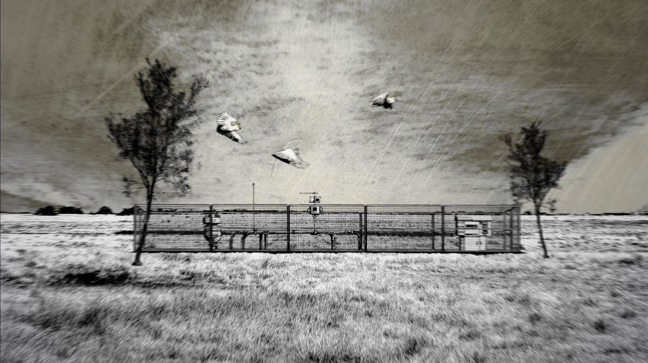
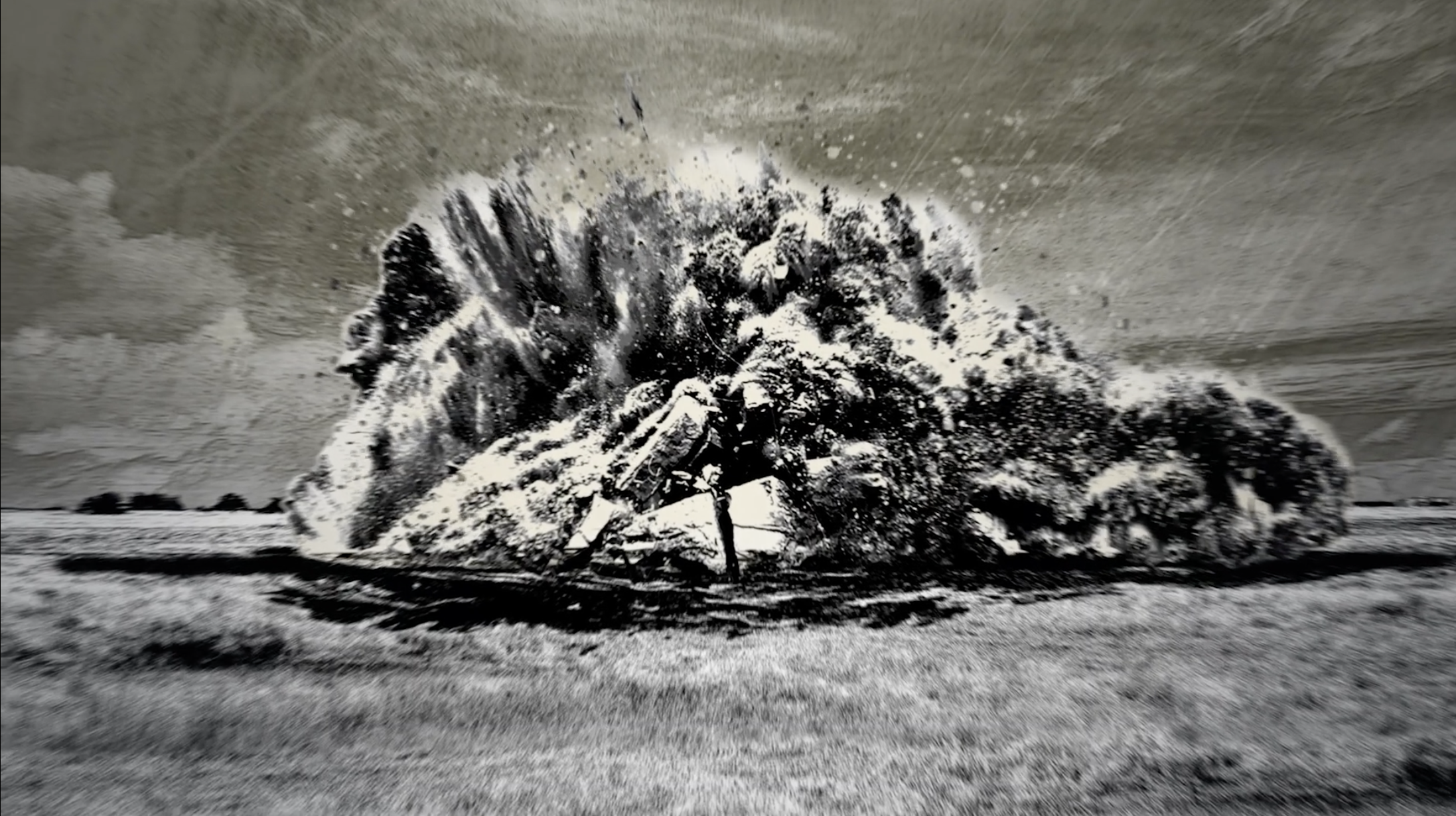
A black-and-white pencil-drawn aesthetic created an intentionally raw visual style that contrasted sharply against typical industrial communications. No heavy graphics, no bright colours, no excessive polish. The animation moved through a direct narrative focused on consequences, risk, and accountability. Without visual clutter, the message had nowhere to hide and no competition for attention. Sometimes the best production decision is knowing what not to add.
Safer Together's strongest-performing piece of content. Widely shared, discussed across worksites, and praised for communicating difficult ideas with unusual clarity.
More Mining & Resources work